

In today’s data-driven business world, presenting information clearly and effectively is critical. Data visualisation types help transform complex data into compelling visuals, making it easier for decision-makers to interpret insights and take action. Whether you’re delivering a financial report, a marketing analysis, or a business strategy presentation, choosing the right data visualisation PPT format can significantly enhance clarity and engagement. This guide explores key data visualisation types, their applications, and how to integrate them into presentations for maximum impact.

Why is Data Visualisation Important in Business Communication?
Data visualisation plays a crucial role in business presentations by converting raw numbers into visually digestible formats. Instead of overwhelming your audience with spreadsheets, well-designed charts, graphs, and infographics can make information more accessible and engaging.
1. Enhances Data Interpretation
Effective data visualisation types help audiences quickly grasp patterns, trends, and key takeaways without sifting through extensive datasets.
2. Improves Decision-Making
Visual representations provide executives and stakeholders with clear insights, enabling them to make informed decisions based on factual data.
3. Engages Your Audience
A data visualisation PPT that incorporates well-designed visuals keeps your audience engaged and attentive, preventing information overload.
4. Simplifies Complex Data
Certain datasets, such as financial reports or market trends, can be challenging to understand. Graphs and charts help break down these complexities for easier comprehension.
5. Strengthens Persuasive Messaging
A compelling visual presentation enhances credibility, making it easier to persuade investors, clients, and stakeholders. Looking for advanced visualization techniques? Read our blog on Treemaps: A Powerful Data Visualization Tool.

5 Key Steps for Effective Data Visualization
To create an impactful data visualisation PPT, follow these essential steps:
Step 1 – Understand Your Data
Before creating visualisations, analyse the dataset. Identify the key insights you want to communicate and ensure the data is accurate and relevant.
Step 2 – Define Your Objective
Clarify your goal—whether it’s to show trends, highlight comparisons, or present statistical relationships. Your objective will determine the best data visualisation type to use.
Step 3 – Choose the Right Visualisation Format
Selecting the right data visualisation type ensures your message is communicated effectively. For example:
- Use line graphs to show trends over time.
- Use pie charts for proportions.
- Use bar charts for comparisons.
Step 4 – Clean and Organise Your Data
Refine your dataset by eliminating errors, duplications, and irrelevant information. Well-prepared data leads to more accurate and visually appealing presentations.
Step 5 – Create and Refine the Visuals
Use professional design tools to develop clear, engaging, and aesthetically pleasing visuals. Ensure your charts and graphs are labelled correctly and colour-coded for readability.
Need help designing engaging presentations? Check out our Portfolio to see our expertise in action.
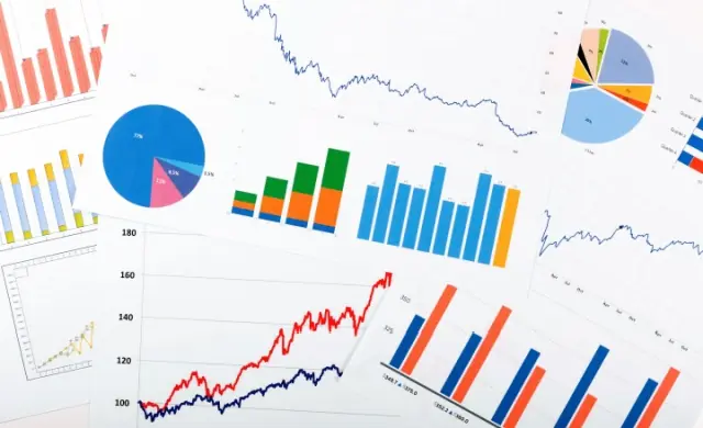
Common Data Visualisation Types for Business Presentations
Different data visualisation types serve distinct purposes. Here are the most commonly used formats in professional presentations:
1. Charts
Pie Chart
Best for displaying proportions, a pie chart visually represents different segments of a whole. It’s widely used in market share analysis, budget breakdowns, and survey results.
Area Chart
Similar to a line graph but with shaded areas, an area chart highlights trends over time, commonly used in sales forecasts and financial projections.
Bubble Chart
Ideal for showing relationships between three variables, bubble charts are used in business strategy and economic research.
Funnel Chart
A funnel chart effectively visualises processes with multiple stages, such as sales pipelines or conversion funnels.
2. Graphs
Line Graph
Used to display trends over time, line graphs are essential for financial reports, performance tracking, and economic data analysis.
Column Chart
A column chart compares different categories of data using vertical bars, making it useful for revenue comparisons and product performance analysis.
Scatter Plot
Best for identifying correlations between two variables, scatter plots are used in market research and statistical analysis.
3. Maps
Treemap
A treemap represents hierarchical data using nested rectangles, often used in financial and organisational reports.
Heat Map
This colour-coded map helps identify patterns and density within datasets, commonly used for website analytics, demographic data, and geographical trends.
Interested in medical industry presentations? Read our blog on Medical PPT to learn how to enhance data storytelling in healthcare.

Choosing the Right Data Visualization Types for Your Presentation
When selecting the best data visualisation types for your data visualization PPT, consider the following:
- What story are you telling? Trends, comparisons, relationships, or distributions?
- Who is your audience? Executives may prefer high-level summary charts, while analysts may need in-depth data.
- What level of detail is required? Keep visuals clear, concise, and aligned with your key message.
Using the wrong type of visualisation can confuse your audience and reduce the effectiveness of your presentation. Want to explore PowerPoint alternatives? Read our comparison on Google Slides vs. PowerPoint to determine the best platform for your needs.

Elevate Your Business Presentations with Expert Data Visualisation
Selecting the right data visualisation types can make the difference between an engaging, insightful presentation and one that overwhelms your audience. Whether you’re preparing a data visualisation PPT for a financial report, a sales strategy meeting, or a research presentation, having well-designed visuals is key to making an impact.
At Presentation Support, we specialise in creating clear, compelling presentations that bring your data to life. Browse our portfolio to see examples of how we transform complex information into visually engaging slides.
Looking for tailored solutions? Our Services cover everything from designing data-driven presentations to creating dynamic visual storytelling for business reports. If you have a project in mind, contact us, and our team will be happy to assist you.
Want to understand pricing options? Check out our Pricing page to explore flexible packages that suit your needs. Whether you’re in London, Manchester, or anywhere in the UK, we’re here to help you craft data visualization PPTs that leave a lasting impression.