Understanding colour theory for presentations is crucial for creating impactful, engaging slides. The right colour combinations enhance clarity, convey emotions, and establish a professional tone. A well-designed colour palette doesn’t just make your slides look appealing—it guides your audience’s attention and helps reinforce your message.
In this article, we’ll explore the fundamentals of colour theory for presentations, including the role of the colour wheel, the types of colours, and practical tips to create visually compelling slides.

What is the Colour Wheel?
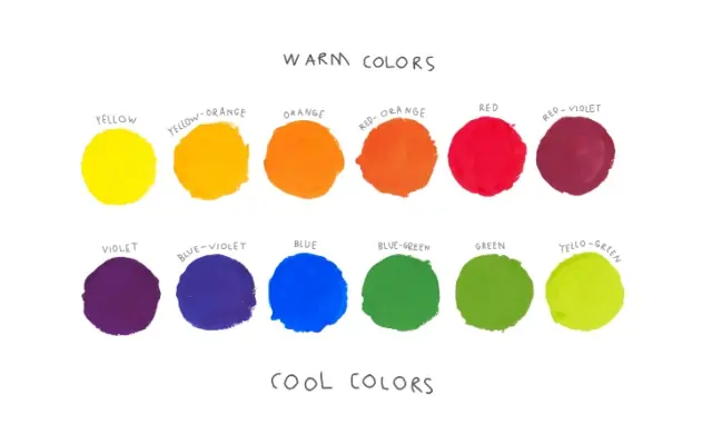
The colour wheel is a circular diagram that illustrates the relationships between different colours. It’s a vital tool for presentation designers, artists, and anyone involved in crafting visual content, including presentations.
- Primary Colours: The building blocks of all other colours—red, blue, and yellow.
- Secondary Colours: Created by mixing two primary colours, such as green (blue + yellow) or orange (red + yellow).
- Tertiary Colours: A blend of primary and secondary colours, offering more nuanced shades like red-orange or blue-green.
The colour wheel helps identify complementary and contrasting hues, ensuring a harmonious design. This is particularly important when designing slides with complex visuals, as it ensures a cohesive look while drawing attention to key points.

Why Colour Theory Matters in Presentation Design
Applying colour theory for presentations is more than just aesthetic—it’s strategic. Here’s why it’s essential:
1. Enhances Audience Engagement
Vivid, harmonious colour schemes capture attention and maintain focus throughout your presentation.
2. Evokes Emotional Responses
Colours influence emotions and perceptions. For example, blue conveys trust, red signifies urgency, and green represents growth.
3. Improves Readability
Contrasting colours between text and background ensure your slides are easy to read, even from a distance.
4. Maintains Branding Consistency
Using your company’s brand colours in combination with the colour wheel keeps your presentation aligned with corporate identity.
5. Emphasises Key Information
Strategic use of bold colours can highlight critical points, guiding the audience’s focus effectively.
For detailed advice on structuring your content alongside colour, explore tips on effective slide layouts.

Key Characteristics of Colour in Design
Understanding the characteristics of colour can elevate your slide design.
1. Hue
The specific shade of a colour, such as red or green. Different hues evoke distinct emotions and associations.
2. Value
Refers to the lightness or darkness of a colour, crucial for creating depth and contrast.
3. Saturation
The intensity of a colour. Highly saturated hues are bold and eye-catching, while muted tones are subtle and sophisticated.
4. Temperature
Colours can be warm (reds, oranges, yellows) or cool (blues, greens, purples). Warm tones are energising, while cool tones are calming.
5. Complementary Colours
Colours opposite each other on the colour wheel, like red and green. These create strong contrasts and make designs pop.
By combining these characteristics, you can create a slide deck that is both visually appealing and functionally effective.

Types of Colour Schemes for Presentations
Using the right colour scheme is integral to applying colour theory for presentations. Here are the most common schemes:
1. Complementary
Combines two colours opposite each other on the wheel, such as blue and orange. This creates high contrast and dynamic visuals.
2. Analogous
Uses colours adjacent to each other, like yellow, yellow-green, and green. It offers a harmonious, balanced look.
3. Monochromatic
Focuses on variations of a single colour, using different shades, tints, and tones for a sleek, professional feel.
4. Triadic
Uses three evenly spaced colours on the wheel, such as red, yellow, and blue. This scheme is vibrant and well-balanced.

Tips for Using Colour Theory in Your Presentation
1. Start with Brand Colours
Begin with your company’s core colours and expand the palette using complementary or analogous shades.
2. Stick to a Limited Palette
Limit your design to three or four main colours to maintain consistency and avoid overwhelming your audience.
3. Ensure Accessibility
Check that your colours are distinguishable to individuals with colour blindness by using online tools.
4. Leverage Colour for Hierarchy
Use bold colours to highlight headings or important data points. For inspiration, see how storytelling in presentations uses visual cues to create emphasis.
5. Test Your Palette
Preview your slides on different devices to ensure the colours appear as intended.

Why the Colour Wheel is Essential for UK Presentations
The colour wheel is a vital resource for creating visually compelling and effective presentations. For UK professionals, whether you’re presenting a business report PPT to executives in London or crafting a marketing pitch, understanding colour theory presentation ensures your slides leave a lasting impact.
At Presentation Support, we specialise in creating bespoke slide design services tailored to your needs. Our expert PPT designers combine colour theory for presentations with professional storytelling techniques to craft visually stunning slides. Explore our portfolio for examples of our work. Get in touch with our team of PPT design agency today via email – [email protected] or contact us today to elevate your presentations to a new level.


