Slide layouts are key to building effective presentations. Think of them as the foundation of your PowerPoint design—they organise your content and enhance how your message is delivered. The right layout can turn a standard slide into a compelling visual, making your points clear and holding your audience’s attention. In this article, we’ll explore the role of slide layouts, why they’re essential, and how they impact presentation design.
When we talk about presentation slide layout, it’s not just about aesthetics. It’s about ensuring that every slide supports your message and structure. PowerPoint offers a variety of layouts, from simple bullet-point designs to dynamic photo-based formats. We’ll guide you through each option, showing you how to choose layouts that best convey your ideas.

What Are Slide Layouts?
Slide layouts are the templates for each slide in a PowerPoint presentation. Acting as a blueprint, layouts structure where content such as text, images, and other elements will be placed. A good layout makes your presentation clean, organised, and easy to follow.
Customising presentation slide layouts lets you experiment with design while keeping your content structured. Using layouts effectively can make your slides stand out, ensuring your presentation is both attractive and impactful.
What Do Slide Layouts Include?
Slide layouts contain essential elements that help organise your presentation. Here’s what you can typically include:
- Text Boxes: For headings, bullet points, and detailed information.
- Image Placeholders: Spaces to add photos, improving visual appeal.
- Charts and Graphs: Display data clearly with designated areas for charts.
- Tables: Arrange data in a neat, row-and-column format.
- Shapes and Icons: Use for emphasis or to add visual interest.
- Video or Audio Clips: Some layouts allow for multimedia, making your slides interactive.
Using these elements strategically enhances the readability of your slides and gives your PowerPoint a professional look.

8 Benefits of Using Slide Layouts in PowerPoint
Utilising slide layouts can make a significant difference in your presentation’s quality. Here’s how:
1. Consistency
Slide layouts keep your entire slide deck cohesive, using the same fonts, colours, and design elements. Consistency maintains audience focus and gives your presentation a smooth flow.
2. Time Efficiency
Slide layouts save time by providing a ready-made structure. You can focus on content rather than design, especially valuable when working to tight deadlines. For more insights on cost-efficient presentations, check out our blog on Presentation Cost.
3. Professional Appearance
A polished slide layout gives your presentation a professional edge, showing attention to detail that adds credibility. This is especially beneficial in business or formal settings.
4. User-Friendly
Slide layouts are easy to use and guide you on where to place text and images. This is ideal for users at all skill levels, from beginners to experienced designers.
5. Content Organisation
Layouts guide you on where to place content, keeping information neat and avoiding clutter. Clear content placement makes your message stronger.
6. Modern Design
Using current PowerPoint slide design templates keeps your presentation visually up-to-date. Industry-aligned layouts reflect the latest trends, ensuring your slides are both stylish and relevant.
7. Visual Appeal
Layouts enhance your presentation’s look by balancing text and visuals. This engages the audience, making your points more memorable.
8. Customisable
Layouts offer flexibility, allowing you to adjust elements to fit your specific needs. Whether you need more space for text or images, layouts can be tailored to suit your presentation.

9 Key Slide Layouts in PowerPoint
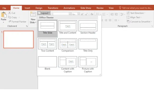
PowerPoint provides a variety of slide layouts, each serving a unique purpose. Here’s a breakdown of the most common layouts:
1. Title Slide
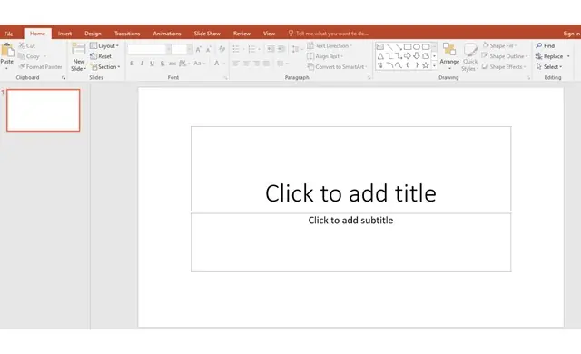
The opening slide for your presentation, designed for titles and subtitles, is especially crucial in setting the tone for presentations like a Startup Pitch Deck, where first impressions matter.
2. Title and Content
A versatile layout with space for text, images, or charts, perfect for content-heavy slides.
3. Section Header
Used to introduce new sections in your presentation, like a chapter heading.
4. Two Content
Splits the slide into two areas, ideal for comparing two elements side-by-side.
5. Comparison
Similar to the two-content layout but tailored for side-by-side comparisons.
6. Title Only
Leaves most of the slide empty, offering flexibility for creative layouts.
7. Blank
An open canvas for customised layouts and unique slide designs.
8. Content with Caption
Designed for images or charts with an area for descriptive text.
9. Picture with Caption
Features space for a large image and a brief caption, perfect for showcasing photos.
Additional Custom Slide Templates
Beyond PowerPoint’s standard slide layouts, here are some useful custom templates:
- Comparison with Chart: Great for data-heavy comparisons.
- Quote Slide: Ideal for highlighting quotes or testimonials.
- Agenda Slide: Keeps your presentation organised and sets audience expectations.
- Thank You Slide: A professional way to conclude your presentation.
- Infographic Slide: Tailored for data storytelling and visualising complex info.
- Timeline Slide: Perfect for presenting events or project milestones in sequence.
- Diagram Slide: Helps explain processes or structures clearly.
PowerPoint’s variety of layouts ensures there’s a design for every purpose. By selecting the right layout, you enhance your presentation’s clarity and impact.

Slides vs. Slide Layouts: Understanding the Differences
While slides and slide layouts are connected, they serve different functions in presentation design:
Similarities
- Design Role: Both contribute to the overall look of the presentation.
- Clarity: Both help deliver your message clearly.
- Aesthetic Impact: Both affect the presentation’s visual appeal.
Differences
- Definition: A slide is an individual page; a slide layout is the template guiding its structure.
- Function: Slides display content, while layouts define design and structure.
- Consistency: Layouts ensure uniformity, making the whole presentation cohesive.
Knowing these distinctions lets you use slides and layouts effectively to enhance your presentation design.

Get the Best Slide Layouts with Presentation Support
We’ve explored the importance of slide layouts in creating effective PowerPoint presentations. From maintaining a professional look to saving time, slide layouts streamline the design process and keep your presentation polished. PowerPoint’s diverse layouts allow you to customise and adapt your slides for any occasion. For exceptional presentation design, Presentation Support’s services can help you make the most of these layouts. Our Presentation Designer team specialises in tailored PowerPoint slide design that transforms ideas into visually compelling presentations. Whether you’re pitching to clients or delivering at a conference, we’re here to make your presentation stand out. Explore our Portfolio to see examples of our impactful designs, and get in touch today for professional design support that enhances your message and elevates your impact.


